


For my final outcome, I intend on creating a piece similar to my “combined imagery” work. specifically one of my experiments. I went out to do a portrait shoot for this, what I need is a combination of close up portraits and head and shoulder shots. Some clear skies must be in the backgrounds.


These are the two images I am going to attempt to combine in the style of Nancy Burson. First of all I am aware of some potential issues. Firstly the shadow on the side of my first portrait, this will make it difficult to merge the right side of both their faces. Secondly the fact that one background is white and the other grey, I will most probably have to change the grey background to white.


I made both of the images black and white as I think this will make them more easy to merge. Then I adjusted the opacity of the second portrait as it will be the top layer. Now all I need to do is correctly overlap them.

My final outcome is quite clearly not up to the standard of Nancy Burson’s impressive work. After hours of adjusting different settings, manipulating both images and lots of cropping and rotating the images I finally realised that i would have to shoot two portraits that are perfectly identical in composition but with different models in order to create work anything near as good as Burson.
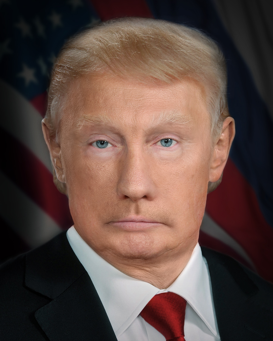
This image from 2017 by Nancy Burson is a combination of a Donald Trump portrait and a Vladimir Putin portrait.
The concept is so simple but the execution of her work is perfect. She spends lots of time editing these images in photoshop, adding layers, merging images and blurring different parts of the images to create a final outcome that looks like a real human. It is almost as if, depending on who you focus on, you can see either Trump or Putin.
I am going to attempt to do this myself for my next piece of work, Distorted Portrait.

I am very pleased with my final outcome, before finalising it I slightly increased the contrast and brightness.

I began this process with a simple portrait I took in the studio. Only one side of the models face is lit.
My intentions are simple, to add a cityscape to the dark side of the image.
The image I will add must be quite faint, I will decrease the opacity to around 60/70%.

The image on the left is what I am layering on top.
As you can see I have made it very opaque.
When I add it onto the other image it should clearly and subtly cover the other side of the image.

For this I created a piece in the style of Pelle Cass’ work. I used his exact technique, setting up a tripod outside my college taking regular pictures when people are walking past (including one shot where there is nobody there, just the landscape). Here is my initial shot:

I then went through my contact sheet and selected the images that contained people I wanted to edit into my image. I decided on 6 more images to add, these are added as layers on top of the background of my Adobe Photoshop file.

Then using layer masks and the brush tool, I would brush over the parts of each image I want to include making them appear. After adding all my layers I created this:
Pelle Cass is an award-winning photographer based in Brookline, Massachusetts who grey up in Boston. His work is world famous and reaches out to an incredibly wide target audience (his most famous series being Selected People). It is as if he has found a way of creating work that fits into both realism and surrealism, he does so much post production without manipulating anything, as he says:
“I don’t change a thing and I never move a figure or doctor a single pixel. I simply decide what’s stays in and what’s left out.”
“I use Photoshop to increase imperfection, not remove it.”
“My work looks real because it is real, even though it’s based on a trick.”


Images from Selected People 2017


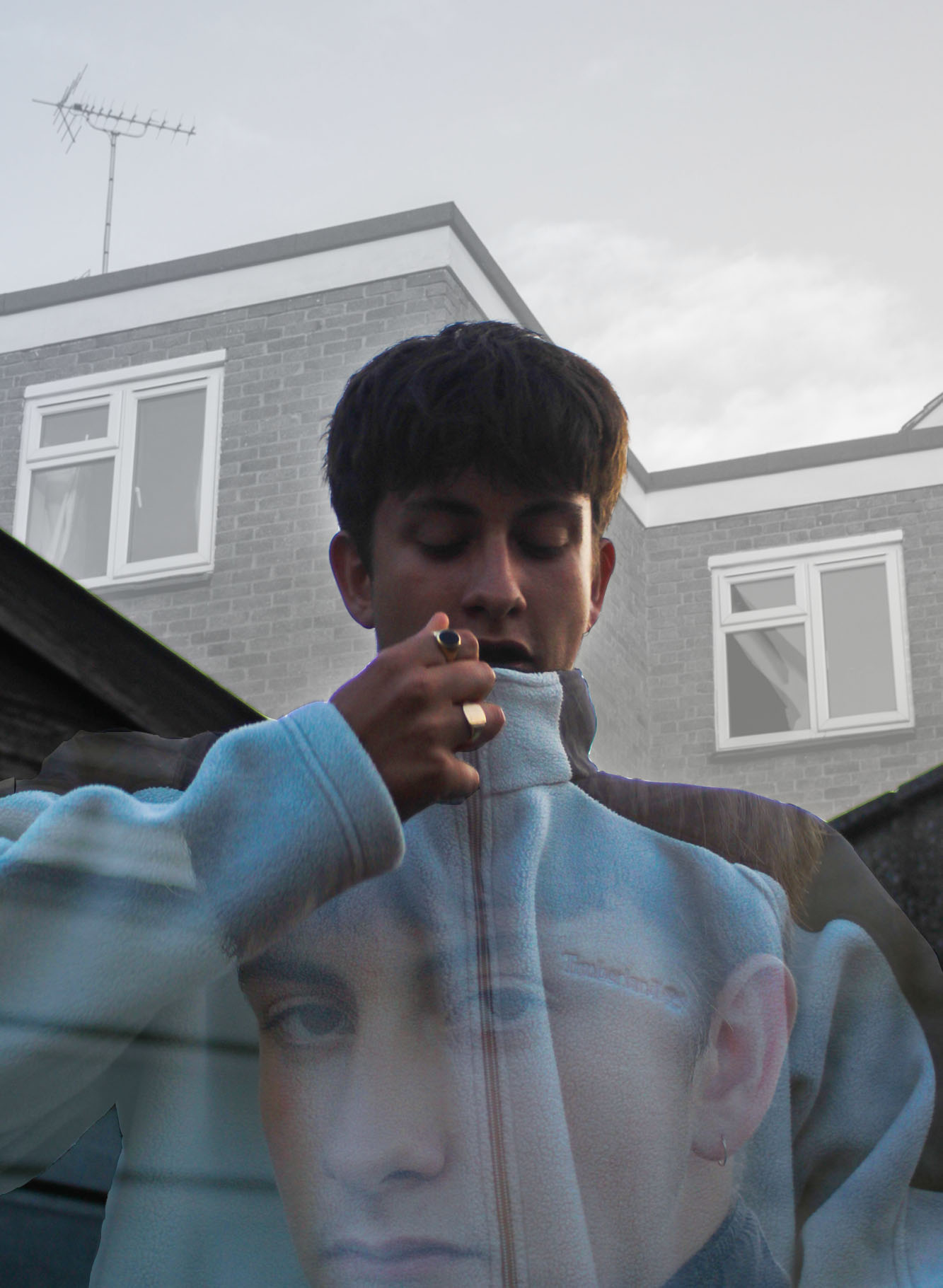
I began with 2 images, a studio portrait and a shot from my “Urban Housing” project.


I opened both of these in Adobe Photoshop and added them as layers on a standard A4 white background. The first step of combining these 2 images is adjusting the opacity of the top layer.


After this you can chose from many different desired effects, all of which are to do with how the two images are combined, I chose to use “lighter colour”.


As you can see here it merges the images in a way that the portrait almost seems to be a silhouette on top of the background however there are some slight colour from my models skins face coming through. To tackle this problem I decided it would be best to make the portrait layer of the image black and white.


At this stage I was very pleased with my work, however I wanted to make it more in the style of Andreas Lie. To do this I wanted to make the background white again and I found the way to make that happen would be to put the opacity back up to 100%.


The final adjustment I wanted to make us to take away the “North Face” logo from my models chest. This is done using the spot healing tool. I believe my final outcome was successfully in the style of Andreas Lie.

